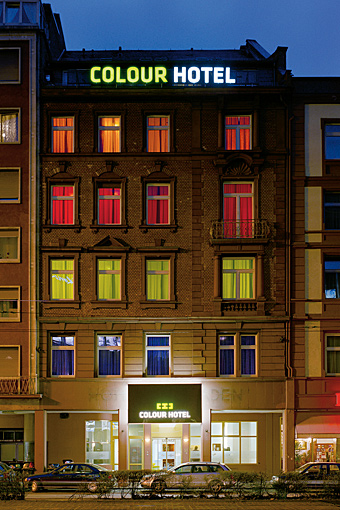
The project comprised a complete internal renovation and re-branding of an existing five-storey hotel.
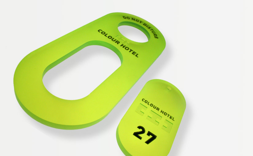
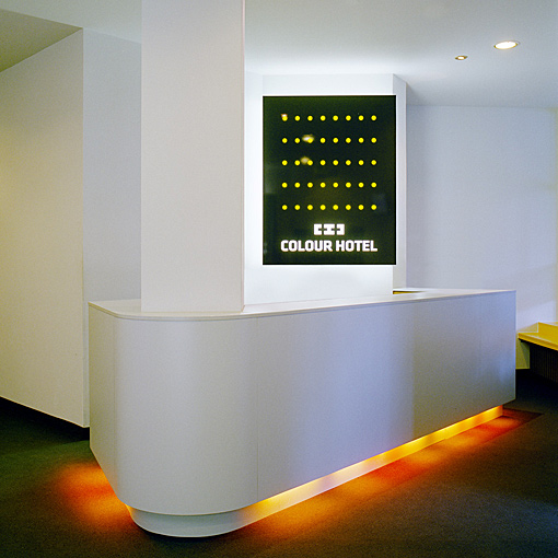
The new branding is comprehensive: the versatility of the logo design enables it to be effortlessly applied to a variety of end uses - from an illuminated sign box on the outside of the building, to stationery and coffee cups in every room. Key holders and visiting cards get the same treatment, as did the semi cryptic reception board indicating the number of floors and rooms.
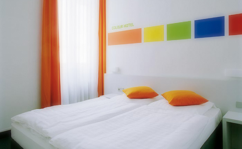
The brand’s impact is heightened through its articulation within a clean white aesthetic. Each of the five floors is assigned its own colour, applied as an accent to a select range of items - cushions, chairs and curtains, the latter being utilized to market the colour concept at street level, the hotel’s front façade functioning as a giant billboard.
In the lobby soft furnishings, bespoke furniture, and even a light box housing a variety of seminal traveling quotes from likes of Goethe and Oscar Wilde disseminate the five-colour palette. The design treatment is measured but playful, a further example of this being the use of over-sized graphics for room numbers and room types to animate the corridors. Finally, an ascent chart, in each room, configured as a modernist graphic, unifies the colour concept.